2019/20 may be the last season we see Liverpool kitted out in New Balance with Nike tipped to take over from next season, pending a court battle.
The Reds were first togged out by New Balance for the 2015/16 season, following the American sportswear company's takeover of Warrior Sports (remember them?) and have produced Liverpool's clobber for the last five seasons.
While fans on Twitter get starry-eyed about the prospect of Drake being used to hawk Liverpool tops under Nike, it's worth remembering New Balance have produced a few modern classics that will forever be associated with the rise of the Reds under Jurgen Klopp. There has, it must be said, also been the odd stinker.

Here's how all 15 of Liverpool's New Balance kits have stacked up so far...
15. 2016/17 - Third

Third kits as a concept are odd.
Worst of the bunch, Liverpool's third strip in 2016/17 was Chernobyl green for the bottom 80% and wheelie-bin grey for the top 20%. I would be curious to know if anyone actually bought this and why.
14. 2015/16 - Third

One year before, it was only slightly better for the Reds, who were kitted out in a collared black and grey eyesore. Fortunately, it was only worn a couple of times.
13. 2019/20 - Third

It seems like if you look at the magic-eye pattern long enough, an image of Jordan Henderson lifting the Premier League might appear. It never does.
12. 2018/19 - Third

For 2018/19, New Balance set out to recreate the popular (if ugly) 2008/09 away kit, which itself was an attempt to recreate the popular (but attractive) away kits of the late eighties. The result was a little bit of a mess.
Gini Wijnaldum made it look good but the man makes everything look good.
11. 2015/16 - Home

On first inspection, it's just a red shirt. Oh no wait, there's some weird check-pattern thing which the club describe as 'tonal jacquard print'.
10. 2018/19 - Away

Good fun but a bit silly. The colour combo is more appropriate for a season in which Liverpool were total crap rather than the one in which they actually won the Champions League.
9. 2016/17 - Away

The red stripes (scratch marks?) on the side are a nice example of the kind of reigned-in flair that was all too rare in Liverpool change kits of the modern era.
8. 2018/19 - Home

After 2017/18, this home kit was a slight letdown. The fit was a little weird and the collar a little clunky. However, it will forever be associated with the Champions League win, which boosts it by several thousand nostalgia points.
7. 2017/18 - Third

Colour-wise, bit weird. Design-wise, decent.
Andy Robertson also claimed the 'lucky' third kit was so bright it did something to the opposition's eyes, so that's nice.
6. 2016/17 - Home

New Balance might have been guilty of under-designing here. It's basically the same as the previous year's, just with gold detail. However, the weird inlaid check pattern thing, sorry tonal jacquard print, is gone, which is a plus.
5. 2015/16 - Away

After years of frankly obscene change efforts under New Balance, Warrior, adidas and Reebok, this plain kit was a welcome palette cleanser.
The clean design only loses points for the unnecessary cuff piping. And the fact that it was a worn for a pretty duff season for the Reds.
4. 2019/20 - Away
Away day ready ⚪️
— Liverpool FC (@LFC) June 7, 2019
Our @NBFootball 19/20 away kit has arrived: https://t.co/xtZslFo3cA#LiveIt pic.twitter.com/DHze7ElGVd
Controversial for its blue detail, this season's away effort is - all rivalry aside - class, mate *insert clapping emojis*.
3. 2017/18 - Away

The best away kit the Reds have produced in what feels like centuries. As with Arsenal's famous bruised banana, providing a fresh twist on a nostalgia-laden classic can pay off big...sometimes.
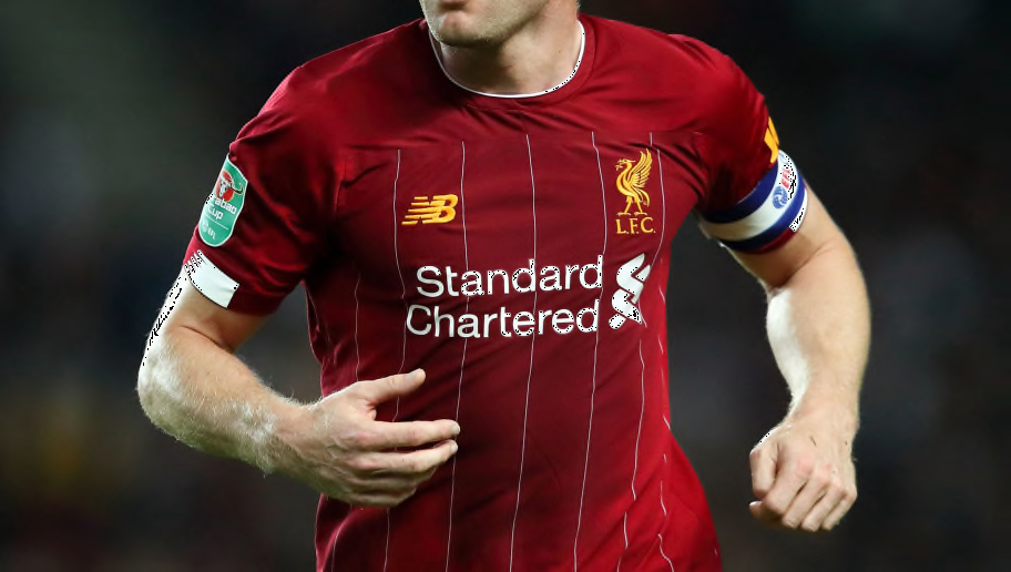
2. 2019/20 - Home

Apart from the questionable use of white on the socks, this is also a near-perfect kit with just the right level of detail and distinct from anything else on the market. The use of gold also feels earned this time.
1. 2017/18 - Home

A perfect example of what a Liverpool home kit should look like: simple, classy and with a nod to history. It is a modern classic as iconic as the 1984 shirt it tried to ape. The switch to the deeper red was also very smart move.
The benchmark for Nike if they do come in.
Source : 90min